GREATEST HITS RADIO
Three adverts for this growing radio station
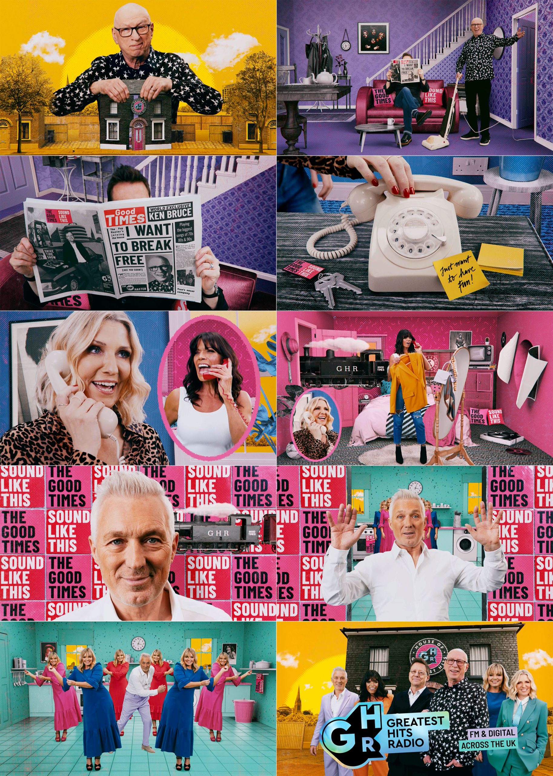
This is the latest of the ads, promoting the arrival of Ken Bruce. The idea was based on ‘The House of GHR’, with each of the vignettes referencing famous music videos.
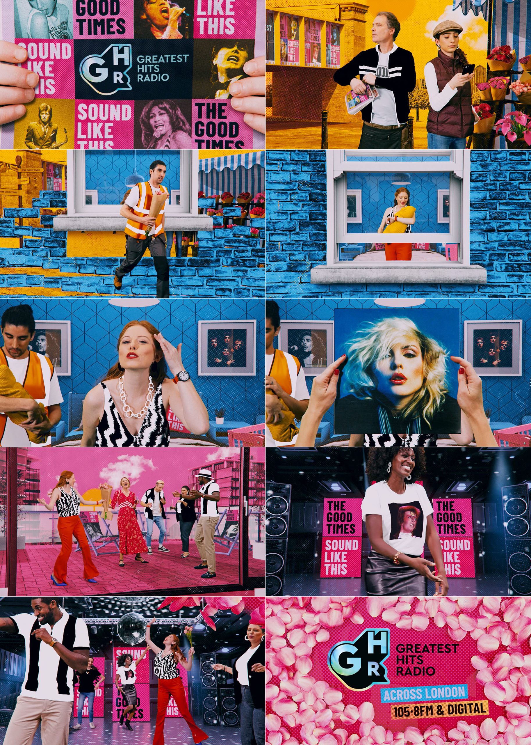
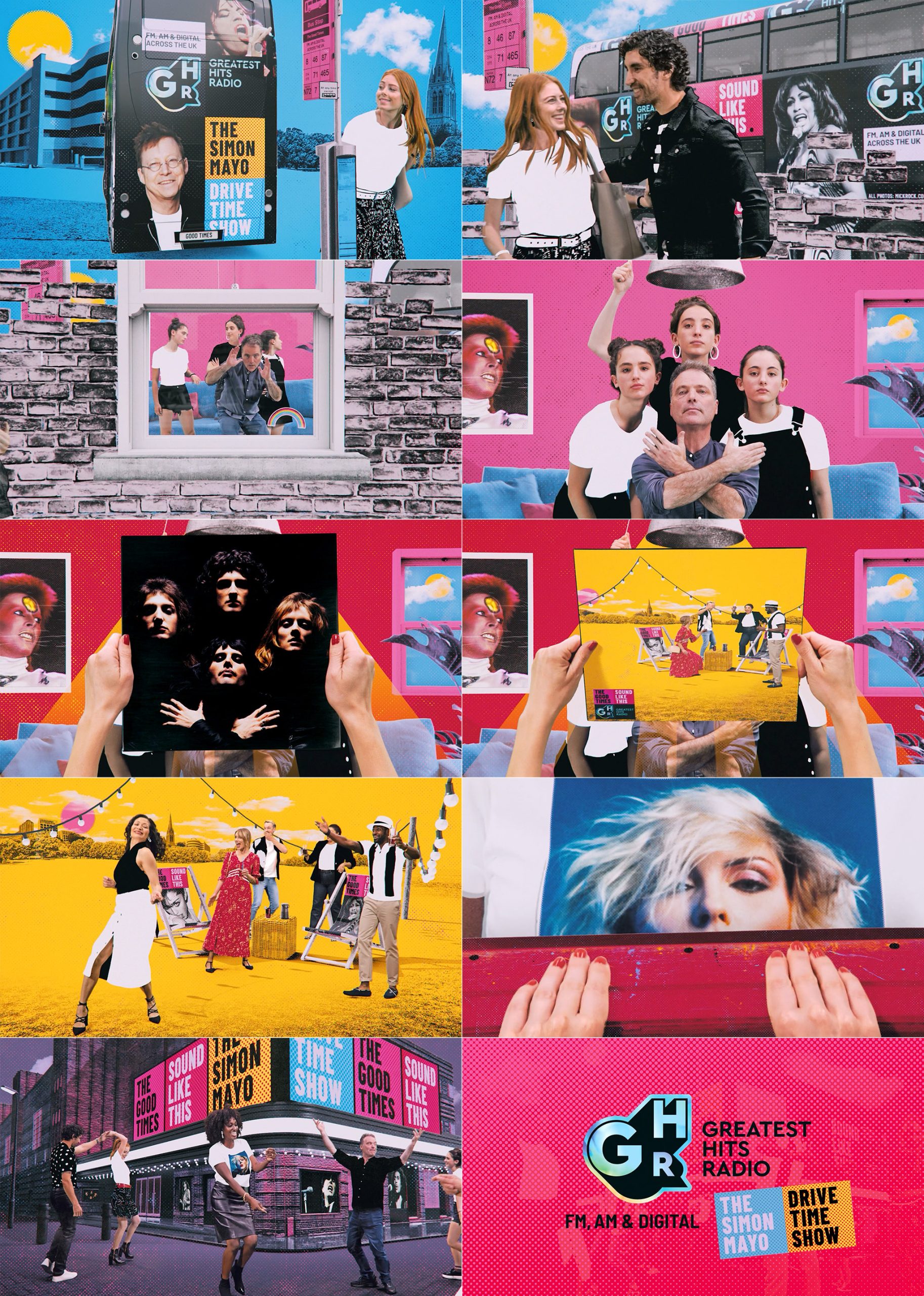
Working with ThinkFarm, we were asked to collaborate on 3 TV and social ads over 3 years, for the Bauer Media owned Greatest Hits Radio. ThinkFarm had originally developed the new identity for the station as it established itself in the market. The tone was upbeat and popular, playing music from the 70’s, 80’s & 90’s. The original ad, which you can see below, dictated the ongoing style. It was shot during COVID, and because we could only shoot people separately, unless they were a family, it meant we had to devise a style that accomodated those restrictions. So shooting the cast individually on green screen and then ‘collaging’ them together later became the ‘GHR style’. The rest of the design really came from these restrictions. You’ll see that the style developed and became more concise over time. Our role was not only help develop the style and narratives, but also the direction on set and all of the post-production. The 3 ads were supported by social and print campaigns and gained good traction. Long may the journey continue…
Agency – Thinkfarm
Producer – Isibeal Ballance & Milly Upton
DOP – Joe Duggan & Martin Roach
Stop frame animation – Matt Cooper
Styling – Doris Helmlinger
Client
Bauer MediaRole
Design, direction, edit, compositing & animationThis was the second of the series. We were asked to re-use some of the footage and animation from the original ad due to budget constraints, so we adopted the same format and continued the narrative we’d established in the first ad by extending the characters storylines. Shooting new elements and then adding them to new scenes worked seemlessly.
And this was the original style setter, and also where we establish the idea of different groups of people coming together in the last scene, joined by a love of music. We actually shot this on a stills camera using a shutter burst, giving us clean, high resolution frames to work with and it added to the animated collage feel.
Here’s the animatic we created for the latest ad. As you can see it ended up being very close to the final version.


